Google Data Studio has 3 different types of tables, one of which is called tables with heat maps. These tables are like the others except that they add the ability to add color pallets to metrics. This makes it really easy to look at lots of data as the cell colors change based on the cell value. Typically, the higher the value, the darker the cell.
Here’s a sample of what a heat map table looks like:

How to Add a Heatmap Table
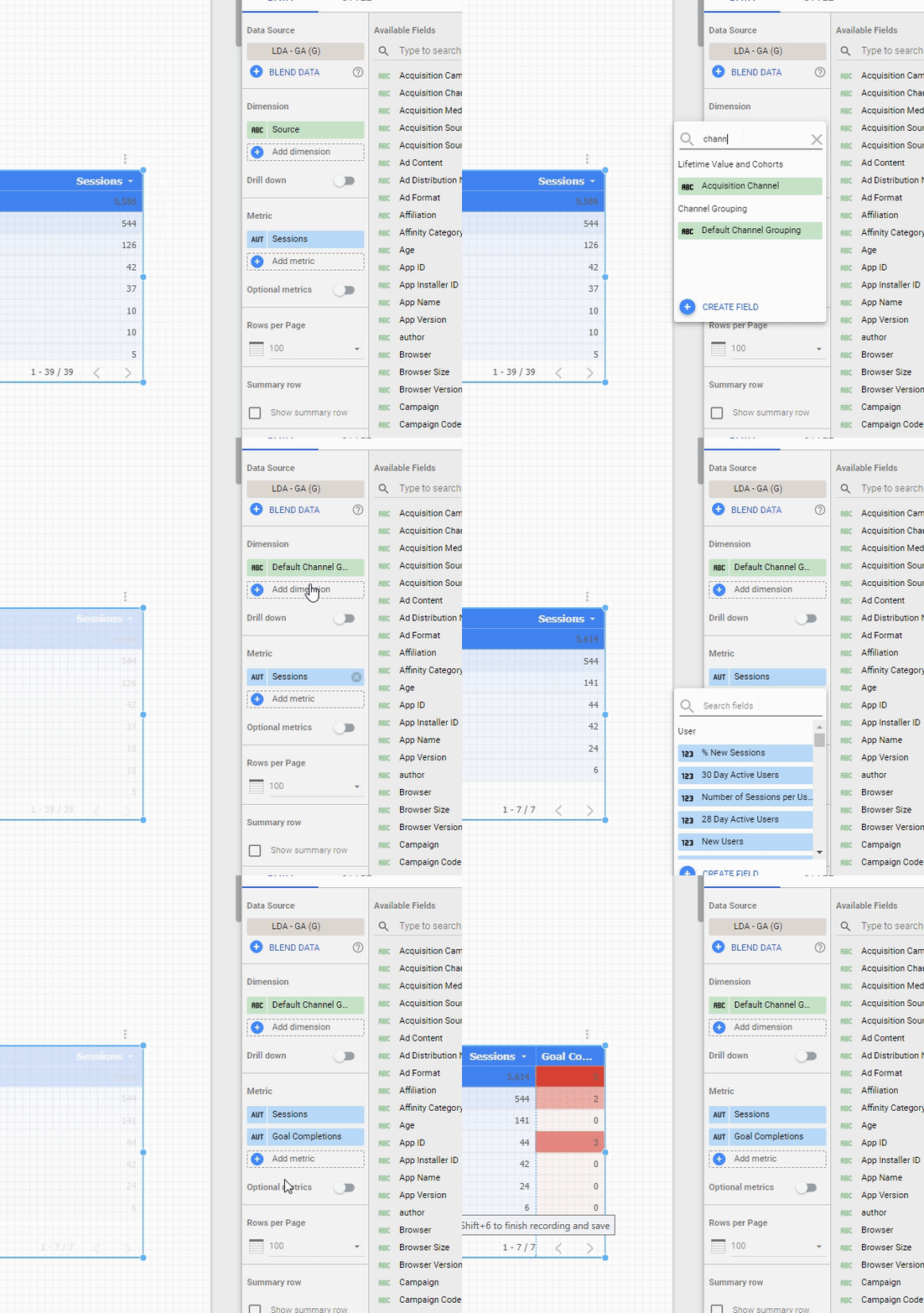
Step 1: Add the Table and Size It
To begin, use the top menu to add the heat map table to your Google Data Studio report.
Step 2: Select Your Dimensions and Metrics
Here, you can decide which dimensions and metrics you want to report on. For each metric you choose, GDS will automatically apply a color pallet for you.

Step 3: Adjust Styles and Colors as Needed to Get the Look You Need
Finally, you’ll use the Style menu to adjust the color pallets, font sizes, etc. as you typically would with any Google Data Studio table.
- Table colors: Adjust the color of the table heading background, row styles, etc.
- Fonts: Adjust the table fonts as needed
- Heat Map Colors: Adjust the color scheme of each metric group with its own color pallet to make for easy viewing of data
Tips for Adding Tables with Heat Maps
- Drill Down: Heatmap tables allow for dimension drill downs just as do other charts in Google Data Studio
- Optional Metrics: Just like other charts in GDS, optional metrics can be added which allow the end user to change the metrics simply by using a selector on the front end
We hope this helps you get started in using Google Data Studio tables with heat maps. Questions and comments below!


Hi,
can you reverse the baseline for the metrics? I have a table where I display negative values. By default DS gives the number, which is the closest to zero, the strongest color. I want to reverse this, so that the most negative value will be the one coloured in the strongest.
Hi Jesse,
I don’t know of a way to do it without elaborate hacks. I’d think that in time you’d get more control over the style of heatmaps in this regard.
In other cases, we just use color selection but in all honesty, we don’t deal in negative values often (mostly web analytics stuff) so I’m just not sure.
Please comment back if you find a work-around!
Rick
Hello! Is there a way to reverse the heatmap? I am using a table and showing Bounce Rates, so naturally a lower bounce rate is better, but higher bounce rates are shaded darker. Is there any way around this?
I found a way by conditionally formatting the table.
Can we apply pagination to heatmaps? I have a table which has 10,000 rows but the heatmap is only showing rows till the page ends.
You can use conditional formatting to reverse the color order for the heatmaps. I do this a lot for analytics reporting bc sometimes the big number is good and sometimes its less good…it makes the heat map easier to assess at a glance.